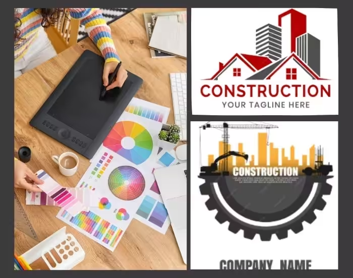
A construction company’s logo isn’t just a symbol—it’s the face of your brand. In a highly competitive market, a bold construction logo communicates reliability, expertise, and professionalism at first glance. From startups to established firms, a thoughtfully designed logo can make your company memorable and inspire trust among clients and partners alike.
Table of Contents
- Why a Bold Construction Logo is Crucial
- The Psychology of Fonts in Construction Logos
- Industrial Textures: Adding Depth and Strength
- Geometric and Modern Icons for Professional Appeal
- Color Palettes That Command Attention
- Scalability and Versatility for Every Medium
- Design Trends in Modern Construction Logos
- Mistakes to Avoid in Construction Logo Design
- Final Thoughts and Call to Action
1. Why a Bold Construction Logo is Crucial
Your logo is often the first impression clients have of your business, and a bold construction logo does far more than simply look attractive. It communicates your company’s story of strength, reliability, and professionalism. A well-designed logo signals that your business consistently delivers quality work, approaches every project with a professional mindset, and can be trusted for long-term partnerships. Beyond its visual appeal, clients subconsciously associate strong lines and geometric forms with stability, precision, and expertise. Choosing the right design, therefore, is not just about aesthetics—it helps your brand stand out in a crowded and competitive industry.
2. The Psychology of Fonts in Construction Logos
Fonts play a critical role in conveying your brand identity. For construction logos, bold and clean fonts suggest power and reliability, while sans-serif styles lend a modern, professional appearance. Custom letterforms can also be used to subtly reflect structural design elements, reinforcing the essence of the construction industry. On the other hand, overly decorative or thin fonts can appear weak or unprofessional, undermining your brand’s authority. A carefully selected font ensures that your logo communicates strength, expertise, and credibility to your audience.
3. Industrial Textures: Adding Depth and Strength
Incorporating textures inspired by construction materials brings authenticity and character to a logo. Metallic effects, such as steel or iron textures, convey durability and resilience, while concrete or brick patterns highlight toughness and craftsmanship. Rough, rugged finishes can communicate hands-on expertise and a practical approach to construction work. When applied subtly, industrial textures create a logo that feels both modern and rooted in the traditional strengths of the construction industry, giving clients a sense of trust and reliability.
4. Geometric and Modern Icons for Professional Appeal
Icons are a powerful tool for instantly communicating the nature of your services. Geometric shapes and modern designs give a logo a clean, professional appearance, helping it stand out across various mediums. Popular icon choices include hard hats, cranes, building outlines, or abstract geometric forms representing structures. Minimalist line drawings can also provide a contemporary feel without cluttering the design. Pairing these geometric icons with bold lines ensures your logo remains recognizable and impactful, whether it appears on business cards, websites, or construction site signage.
5. Color Palettes That Command Attention
Color selection is critical in shaping perception. Strong palettes for construction logos often include navy or dark blue to convey trust and reliability, gray or metallic tones to suggest professionalism and durability, and bright colors like orange or yellow to represent energy, safety, and visibility. Black or charcoal can also be used to communicate sophistication and strength. Choosing two to three complementary colors maintains visual consistency across your brand’s touchpoints, ensuring that the logo is instantly recognizable and leaves a lasting impression.
6. Scalability and Versatility for Every Medium
A construction logo must be effective across all sizes and formats. From small social media icons to large billboards, your logo should remain clear, legible, and visually appealing. This requires simplifying details for small-scale applications and creating variations for horizontal, vertical, or monochrome versions. Testing your logo in black and white ensures readability and contrast in any setting. By prioritizing scalability and versatility, you can ensure that your brand maintains a strong, professional presence wherever it appears.
7. Design Trends in Modern Construction Logos
Keeping your logo modern helps your brand stay relevant. Current trends include:
-
Minimalist designs: Clean, geometric, and professional
-
Negative space techniques: Cleverly using blank space for hidden imagery
-
Layered textures: Adding subtle depth without clutter
-
Custom typography: Unique fonts that reflect structural integrity
Combining these trends with traditional bold elements balances modern appeal with timeless reliability.
8. Mistakes to Avoid in Construction Logo Design
Even experienced designers can make errors. Avoid:
-
Overcomplicated logos with too many icons or colors
-
Fonts that are hard to read or outdated
-
Generic, copied designs lacking originality
-
Ignoring how the logo appears across different media
Keeping your design simple, strong, and consistent ensures it remains memorable and trustworthy.
9. Final Thoughts and Call to Action
A bold construction logo is a critical investment in your company’s future. Strong fonts, geometric icons, and industrial textures communicate professionalism, reliability, and craftsmanship—qualities every client seeks.
Designing a logo that resonates with your audience can elevate your brand above competitors. Ready to build a construction logo that inspires trust and sets your brand apart? Contact us today to start your custom logo journey.
