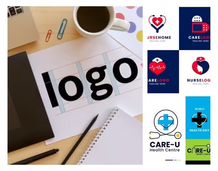
A healthcare logo is often the first visual connection patients have with your clinic, setting the tone for trust, care, and professionalism. Healthcare Logo Design goes beyond aesthetics—it conveys cleanliness, reliability, and emotional reassurance. Using a modern cross symbol with soothing blue and white tones can create a logo that communicates your clinic’s commitment to high-quality care. Whether featured on websites, social media, or printed materials, a thoughtfully designed healthcare logo helps private clinics stand out while fostering patient confidence. This blog explores essential principles for creating a modern healthcare logo that is simple, hygienic, and emotionally reassuring.
Table of Contents
- Why a Healthcare Logo Matters
- The Power of Simplicity in Logo Design
- Using the Cross Symbol to Communicate Care
- Colors That Convey Trust and Hygiene
- Emotional Reassurance Through Design Elements
- Designing for Digital and Print Platforms
- Modern Trends in Healthcare Logo Design
- Common Mistakes to Avoid
- Final Thoughts and Call to Action
1. Why a Healthcare Logo Matters
A healthcare logo represents your clinic’s identity and values. Patients associate a professional and well-designed logo with competence, cleanliness, and empathy. For private clinics, the logo often serves as the first touchpoint, appearing on websites, appointment cards, and signage. A thoughtfully designed healthcare logo communicates trust and care instantly, distinguishing your clinic from competitors and reinforcing your commitment to patient well-being.
2. The Power of Simplicity in Logo Design
Simplicity is crucial in healthcare logo design. A clean, uncluttered logo enhances readability, scalability, and memorability. Simple designs are easier for patients to recognize and recall, while complicated logos can appear overwhelming or confusing. Minimalist logos also communicate professionalism and organization, qualities that patients value in a healthcare provider. By focusing on core elements and avoiding unnecessary details, you create a logo that is timeless and universally approachable.
3. Using the Cross Symbol to Communicate Care
The cross is a universal symbol of healthcare and immediately conveys medical services. A modern interpretation of the cross can make your clinic’s logo look contemporary while maintaining instant recognition. Integrating subtle curves, geometric forms, or abstract designs into the cross symbol can create a unique, professional identity. This symbol reassures patients, emphasizing care, reliability, and competence in your clinic.
4. Colors That Convey Trust and Hygiene
Color choice is essential in conveying trust, cleanliness, and emotional reassurance. Blue is the most widely used color in healthcare, as it evokes calm, trust, and professionalism. White communicates hygiene, purity, and clarity, while subtle accents in gray or soft teal can enhance a modern feel. Using a consistent color palette across all branding materials helps patients associate your clinic with reliability, cleanliness, and high-quality care.
5. Emotional Reassurance Through Design Elements
Beyond symbols and colors, design elements play a key role in evoking patient confidence. Rounded edges and smooth lines suggest approachability and comfort, while balanced spacing and symmetry convey professionalism and stability. A modern healthcare logo that combines these elements can create a welcoming impression, reduce anxiety, and help patients feel safe and cared for even before entering your clinic.
6. Designing for Digital and Print Platforms
Your healthcare logo should perform seamlessly across digital and physical media. Vector-based designs ensure clarity and adaptability for websites, social media, brochures, signage, and appointment cards. Testing the logo in different sizes and color variations ensures readability and impact in every context. A versatile logo enhances brand recognition, making it easier for patients to identify your clinic across multiple touchpoints.
7. Modern Trends in Healthcare Logo Design
Current trends in healthcare logo design include:
- Minimalist and flat logos for clarity and versatility
- Subtle geometric or abstract cross symbols for a modern look
- Soft, calming color palettes with a professional edge
- Adaptive logos that work in both digital and print formats
Following these trends ensures your clinic’s logo looks contemporary, professional, and approachable while remaining timeless.
8. Common Mistakes to Avoid
Common pitfalls include overcrowding the logo with icons, using overly bright or harsh colors, or selecting fonts that are difficult to read. Ignoring scalability and brand consistency can also undermine your logo’s effectiveness. Avoiding these mistakes ensures that your healthcare logo communicates professionalism, hygiene, and trust consistently.
9. Final Thoughts and Call to Action
A modern healthcare logo is an essential tool for private clinics seeking to establish trust and professionalism. By focusing on simplicity, hygiene, and emotional reassurance, your logo can make a strong first impression, foster patient confidence, and enhance brand recognition.
Ready to design a healthcare logo that conveys trust and care? Contact us today to create a professional logo that represents your clinic’s values and dedication to patients.
