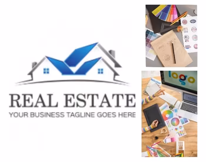
In the real estate industry, a logo isn’t just a design—it’s a symbol of trust, growth, and professionalism. Real Estate Logo Design communicates your company’s credibility to clients, whether you’re a realtor, developer, or architect. A well-crafted logo featuring a roofline, skyline, or abstract property motif conveys stability and success, making your business instantly recognizable. From websites to signage, business cards, and social media, a professional logo is a vital part of your brand identity. This blog explores strategies for creating real estate logos that inspire confidence and reflect the unique focus of your business.
Table of Contents
- Why a Real Estate Logo is Essential
- Using Rooflines and Skylines to Convey Stability
- Fonts and Typography That Reflect Professionalism
- Color Choices for Growth and Trust
- Tailoring Logos for Developers, Realtors, and Architects
- Simplicity and Memorability in Design
- Adapting Your Logo for Digital and Print Use
- Real Estate Logo Design Trends
- Common Pitfalls to Avoid
- Final Thoughts and Call to Action
1. Why a Real Estate Logo is Essential
A real estate logo is a visual representation of your company’s values and expertise. For clients, a professional logo instantly communicates trustworthiness and competence. Whether on your website, social media profiles, or printed materials, a well-designed logo helps your business stand out in a crowded market. A strong logo also reinforces brand recognition, builds credibility, and conveys that your company is serious about providing reliable property solutions.
2. Using Rooflines and Skylines to Convey Stability
Roofline and skyline icons are highly effective symbols in real estate logos. A roofline can represent homes, community, and shelter, conveying a sense of safety and reliability. Skylines, on the other hand, are ideal for urban developers, architects, or realtors dealing with commercial properties, symbolizing growth, ambition, and modernity. These visual elements instantly communicate the focus of your business while reinforcing stability and professionalism in your brand image.
3. Fonts and Typography That Reflect Professionalism
Typography plays a critical role in real estate branding. Clean, bold sans-serif fonts often convey stability, authority, and modernity, while serif fonts can add a touch of sophistication and trust. It’s important to choose fonts that are legible across all media—from business cards and signage to websites and social media. A thoughtfully chosen font pairs seamlessly with your logo icon, enhancing the overall professional impression of your real estate brand.
4. Color Choices for Growth and Trust
Colors influence perception and evoke emotion. For real estate logos, shades of blue often communicate trust and reliability, green can symbolize growth and prosperity, and gray or black conveys professionalism and stability. Using a consistent palette across your website, social media, and printed materials strengthens your brand identity and reassures clients that your business is dependable and capable. Subtle accent colors can also add energy and modernity without overwhelming the design.
5. Tailoring Logos for Developers, Realtors, and Architects
Different real estate professionals have unique branding needs. Developers may prefer logos that emphasize urban skylines, modern architecture, or innovative construction designs. Realtors often benefit from logos featuring rooflines or home icons that communicate trust and familiarity. Architects may choose sleek, minimalist logos that highlight design and creativity. Customizing your logo to your professional focus ensures it resonates with your target audience and strengthens your niche identity.
6. Simplicity and Memorability in Design
A real estate logo should be simple, clean, and easy to remember. Overly complicated logos can confuse clients and fail to scale effectively across various applications. Minimalist designs with clear lines, balanced spacing, and distinct shapes are more versatile and recognizable. A memorable logo helps potential clients recall your brand quickly, increasing trust and engagement.
7. Adapting Your Logo for Digital and Print Use
Your logo must look excellent in both digital and physical contexts. Vector files ensure scalability for websites, social media, brochures, signage, and business cards. Testing variations for horizontal, vertical, and monochrome formats ensures clarity in all mediums. A versatile real estate logo maintains its professional appearance across every platform, reinforcing brand recognition and credibility.
8. Real Estate Logo Design Trends
Modern trends in real estate logos include:
- Minimalist roofline or skyline icons
- Flat and geometric design styles for clarity
- Gradients or subtle shadows for depth without clutter
- Adaptive logos that work seamlessly across digital and print platforms
Following these trends helps your logo appear contemporary and professional while remaining timeless and credible.
9. Common Pitfalls to Avoid
Common mistakes include overcrowding the design with too many elements, using illegible fonts, applying clashing colors, or ignoring scalability. Avoiding these errors ensures that your real estate logo communicates professionalism, stability, and growth, leaving a lasting impression on clients.
10. Final Thoughts and Call to Action
A modern and professional real estate logo is an essential tool for building trust, reflecting stability, and demonstrating growth. By combining roofline or skyline icons with appropriate colors, fonts, and simple, memorable design principles, your logo can strengthen brand recognition and attract the right clients.
Ready to create a real estate logo that represents your business’s expertise and vision? Contact us today to design a professional logo that sets your brand apart.