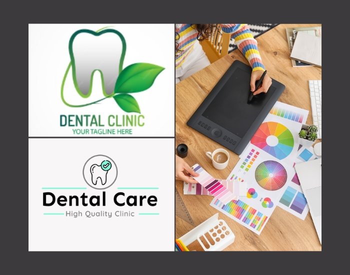
In the dental industry, first impressions matter just as much as a patient’s smile. Dental Clinic Logo Design is essential for establishing trust and professionalism, while also conveying a friendly and welcoming environment. A well-crafted logo featuring a smile or tooth icon with soothing blue and white tones can help your clinic stand out, attract new patients, and create a lasting sense of comfort. Whether displayed on websites, social media, or printed materials, your logo is the visual cornerstone of your brand and sets the tone for patient experience. In this blog, we explore how to design dental clinic logos that combine friendliness, professionalism, and patient trust.
Table of Contents
- Why a Dental Clinic Logo is Important
- Choosing Friendly Fonts for Your Logo
- Colors That Promote Calm and Trust
- Smile and Tooth Icons: Symbols of Care
- Simplicity and Clean Design Principles
- Adapting Your Logo for Digital and Print
- Modern Dental Logo Design Trends
- Mistakes to Avoid in Dental Logo Design
- Final Thoughts and Call to Action
1. Why a Dental Clinic Logo is Important
A dental clinic logo is more than just a visual symbol—it’s a representation of your practice’s values, professionalism, and patient care. A clean and friendly logo instantly communicates trust and comfort, making patients feel at ease even before they step into your clinic. A well-designed dental logo distinguishes your clinic from competitors, highlights your expertise, and helps establish a strong, recognizable brand identity. Patients often remember a logo as much as they remember the care they received, making it a crucial part of your marketing strategy.
2. Choosing Friendly Fonts for Your Logo
Typography plays a vital role in creating a welcoming atmosphere. Fonts for dental clinic logos should be approachable, clean, and legible. Rounded sans-serif fonts often convey friendliness and calmness, while slightly bolder options can suggest professionalism and reliability. Avoid overly decorative or thin scripts that are difficult to read, as clarity is essential for building patient trust. The right font complements your icon and color palette, creating a cohesive and professional brand image.
3. Colors That Promote Calm and Trust
Color choices are critical in shaping perception in healthcare. Blue is widely associated with trust, calmness, and professionalism, while white evokes cleanliness and purity. Additional accent colors like soft teal or light gray can enhance the soothing effect without overwhelming the design. Using a consistent color palette across your logo, website, and printed materials reinforces your brand identity and helps patients feel comfortable and confident in your services.
4. Smile and Tooth Icons: Symbols of Care
Icons are a powerful visual shorthand for your services. Smiles, teeth, or abstract dental symbols immediately convey the nature of your practice and help patients connect with your brand. A minimalist tooth icon paired with a gentle smile curve can communicate both expertise and warmth. Modern dental logos often use simple, geometric shapes to create icons that are easy to recognize and scalable across multiple platforms.
5. Simplicity and Clean Design Principles
A clean logo design ensures versatility and memorability. Avoid cluttering your dental logo with too many details, gradients, or competing elements. Simple, uncluttered logos translate well across various applications—from social media avatars and website headers to business cards and office signage. Clean design not only looks professional but also communicates clarity, trust, and approachability—qualities every patient seeks in a dental practice.
6. Adapting Your Logo for Digital and Print
Your logo must perform consistently in both digital and physical formats. High-resolution vector files ensure clarity on websites, social media, and printed materials such as brochures or appointment cards. Testing your logo in different sizes, backgrounds, and monochrome variations ensures readability and visual appeal in all contexts. A versatile dental logo maintains its integrity across every touchpoint, reinforcing your brand identity with patients.
7. Modern Dental Logo Design Trends
Current trends in dental logo design include:
-
Minimalist and flat design for clarity and scalability
-
Soft, rounded typography that conveys friendliness
-
Abstract dental icons for a contemporary feel
-
Integrated smile curves or subtle dental motifs for uniqueness
Following these trends can give your clinic a modern, professional, and approachable brand image while remaining timeless and trustworthy.
8. Mistakes to Avoid in Dental Logo Design
Common pitfalls include overcomplicated icons, harsh color contrasts, illegible fonts, and inconsistent branding across platforms. Avoiding these mistakes ensures that your logo communicates professionalism, warmth, and trust—qualities patients value in healthcare providers.
9. Final Thoughts and Call to Action
A clean and friendly dental clinic logo is more than a design—it’s a vital tool for building patient trust and establishing your practice’s brand identity. By combining friendly fonts, calming colors, and thoughtful icons, your logo can leave a lasting impression and make patients feel confident in your care.
Ready to create a dental logo that builds trust and stands out? Contact us today to design a professional logo that represents your clinic’s values and expertise.

