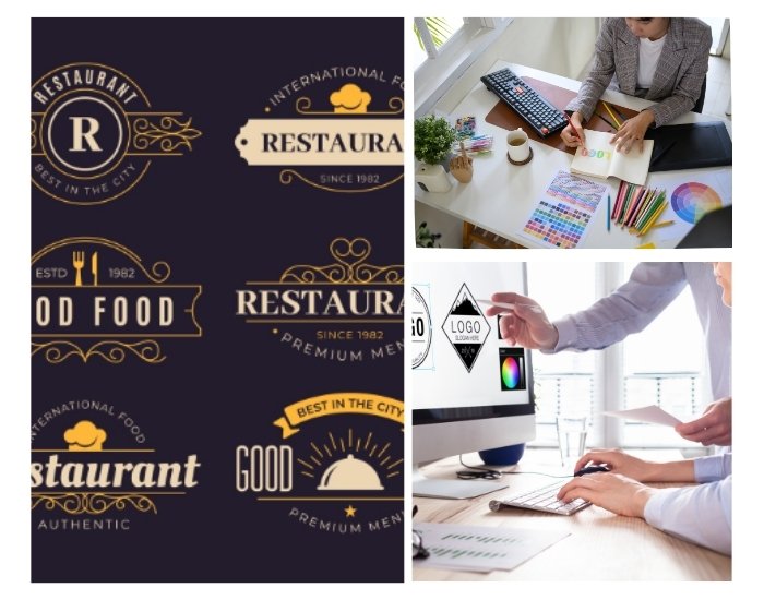
Restaurant & food business logos are more than just a design—it’s the first bite of your brand experience. Restaurant Logo Design communicates your style, quality, and personality to customers even before they taste your food. Whether it’s a pizza shop, café, or gourmet restaurant, a well-designed logo with appetizing colors, clean typography, and approachable imagery draws attention, builds brand recognition, and stimulates hunger. In this blog, we explore key strategies to design food business logos that leave a lasting impression and make customers excited to try your offerings.
Table of Contents
- Why a Restaurant & Food Business Logo Matters
- Using Appetizing Colors
- Typography That Enhances Approachability
- Incorporating Food Icons and Symbols
- Balancing Simplicity and Creativity
- Adapting Logos for Digital and Print Media
- Modern Trends in Restaurant & Food Business Logo Design
- Common Mistakes to Avoid
- Final Thoughts and Call to Action
1. Why a Restaurant & Food Business Logo
Restaurant & food business logos are the visual ambassador of your culinary brand. It sets expectations for quality, style, and atmosphere while helping your business stand out in a competitive market. Customers often make snap judgments based on visuals, so a professional, appetizing logo can encourage them to explore your menu. A strong logo builds recognition across websites, social media, menus, packaging, and signage, establishing a consistent brand identity that makes your restaurant memorable.
2. Using Appetizing Colors
Colors play a crucial role in stimulating appetite and creating emotional connections. Warm tones like red, orange, and yellow are known to increase hunger and excitement, while greens and browns can communicate freshness, organic ingredients, and natural flavors. Using a balanced color palette ensures your logo is visually appealing, memorable, and aligned with the personality of your food brand. Thoughtful color selection also strengthens brand recognition across all marketing channels.
3. Typography That Enhances Approachability
Typography sets the tone for your restaurant’s personality. Clean, legible fonts convey professionalism, while rounded or hand-drawn styles suggest warmth and friendliness. For gourmet or high-end establishments, serif fonts can add sophistication, while playful, bold fonts work well for casual eateries. Choosing the right typography ensures your logo communicates your brand identity effectively and remains readable across menus, websites, and social media.
4. Incorporating Food Icons and Symbols
Icons and symbols immediately communicate your type of cuisine or service. Pizza slices, coffee cups, utensils, or chef hats make logos instantly recognizable and appetizing. Abstract or minimalist food icons can also create a modern and versatile logo suitable for digital and print platforms. Icons help your brand stand out and convey your culinary offerings without relying on text alone.
5. Balancing Simplicity and Creativity
A restaurant logo should balance simplicity with creativity. Overly complex designs can confuse customers and reduce scalability, while simple, clean logos are more versatile and memorable. Incorporating subtle details or unique elements makes the logo distinctive while ensuring it works well on social media, menus, packaging, and signage. Minimalist yet creative designs create an approachable and professional impression.
6. Adapting Logos for Digital and Print Media
Restaurant logos must perform well across digital and physical formats. Vector-based designs maintain clarity for websites, social media, packaging, menus, and signage. Testing your logo in various sizes, color schemes, and orientations ensures readability and visual impact in all contexts. A versatile logo strengthens brand consistency and helps your food business remain memorable to customers across multiple touchpoints.
7. Modern Trends in Restaurant & Food Business Logo Design
Current trends in restaurant logo design include: flat and minimalist icons, appetizing color palettes, hand-drawn typography, and adaptive logos for both digital and physical applications. Incorporating these trends helps your logo appear contemporary, professional, and aligned with customer expectations while remaining versatile and timeless.
8. Common Mistakes to Avoid
Common mistakes include overcrowding logos with too many elements, using overly complex fonts, or choosing colors that clash. Avoiding these errors ensures your restaurant logo communicates warmth, professionalism, and appetite appeal effectively. Ensuring scalability and consistency also prevents your logo from losing impact across different applications.
9. Final Thoughts and Call to Action
A professional restaurant & food business logo is an essential ingredient for brand success. By combining appetizing colors, clean typography, simple yet creative icons, and versatile design, you can create a logo that attracts customers, builds recognition, and stimulates appetite.
Ready to design a restaurant & food business logo that makes customers hungry and excited to try your food? Contact us today to create a professional logo that perfectly represents your culinary brand.

